
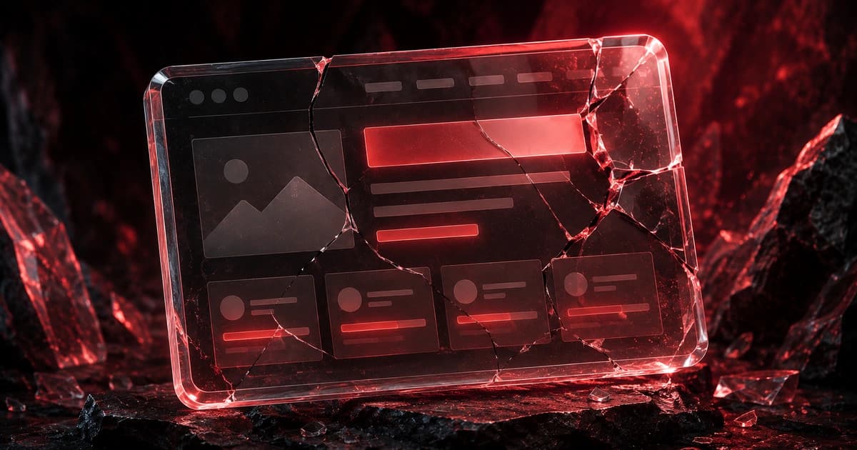
Website Red Flags: 15 Things That Make Visitors Leave
These are the website red flags that quietly torch your credibility and send visitors to a competitor, usually within seconds, and usually without you ever knowing it happened. Here are the 15 worst offenders, why each one costs you, and how to fix it fast.
Visitors don’t email you to say “your site felt sketchy, so I left.” They just leave. That’s what makes red flags so dangerous: they do their damage silently, and the owner (who’s proud of the site and looks at it every day) is the last person to see them.
The research backs this up. Decades of usability work, including Nielsen Norman Group’s findings on the factors that make a website trustworthy, show that visitors form credibility judgments fast and from small signals: a typo, a stock photo, a dated layout. Below are the 15 red flags that do the most damage, grouped by the kind of trust they break, each with the cost and the fix. If your site is getting traffic but no customers, you’ll probably recognize a few.
- Trust
- Design
- Copy
- Technical
- Mobile
Trust red flags
1. You’re hiding who you are.
No real address, no phone number, no named humans: just a contact form into the void.
Why it costs you:If a visitor can’t tell who’s behind the site, the instinct is “what else are they hiding?” Anonymity reads as risk.
2. Your “team” is clearly stock photos.
Generic smiling models where real faces should be.
Why it costs you:Visitors recognize stock photography instantly, and it signals “there may be nothing real here.” It undercuts every claim on the page.
3. There’s no proof, or the proof looks fake.
No reviews, no testimonials, or a wall of anonymous five-star quotes that read like you wrote them.
Why it costs you: Claims are free, so visitors discount them. Without believable proof, your strongest selling points carry no weight.
4. The site isn’t secure.
A “Not secure” warning in the address bar, or a checkout that doesn’t feel safe.
Why it costs you: A browser security warning is an instant, non-negotiable trust killer, especially anywhere money or personal data is involved.
Design red flags
5. It looks like it’s from 2012.
Dated templates, gradients, tiny clip-art icons, a layout that screams “old.”
Why it costs you:Visitors read “outdated site” as “outdated business”, or worse, “are they even still around?”
6. Everything is shouting at once.
No whitespace, competing banners, three popups, five colors of bold text.
Why it costs you: When everything demands attention, nothing gets it, and clutter itself reads as unprofessional and overwhelming.
7. The design is inconsistent.
Three fonts, mismatched buttons, colors that change page to page.
Why it costs you: Inconsistency signals carelessness, and carelessness about the website implies carelessness about the work.
8. The text is unreadable.
Tiny fonts, low-contrast gray-on-gray, text over busy images.
Why it costs you:If reading is effort, visitors don’t push through: they leave. Poor contrast also fails real accessibility needs.
Copy red flags
9. The headline could belong to anyone.
“Innovative solutions for modern businesses.” Vague, generic, meaningless.
Why it costs you: Your headline is the one line everyone reads. If it says nothing specific, visitors learn nothing and leave.
Empowering businesses to reach their full potential.
Bookkeeping for restaurants: close your books in a day, not a week.
Why it works: it names a specific audience and a concrete outcome, so the right visitor instantly knows they’re in the right place. More on this in how to write a homepage headline that converts.
10. It’s all about you, not the customer.
“Founded in 2009, we are a passionate team committed to excellence…”
Why it costs you: Visitors arrive with a problem. A page about your history answers a question nobody asked and buries what they came for.
11. Typos and broken grammar.
Spelling mistakes, mangled sentences, “your” for “you’re.”
Why it costs you: Errors read as a lack of attention to detail, and visitors transfer that to your actual work. Usability research notes how quickly a single visible typo can drop credibility.
Technical red flags
12. The page is slow.
A spinner, a blank screen, a hero image that takes its time.
Why it costs you: Impatient visitors leave before the page is usable, and you lose them before a single word lands.
13. Things are broken.
Dead links, 404s, a contact form that doesn’t send, buttons that do nothing.
Why it costs you:A broken element doesn’t just fail its own job: it tells the visitor “no one’s minding this site,” which poisons trust in everything else.
Mobile red flags
14. It’s not built for phones.
Pinch-to-zoom required, desktop layout crammed onto a small screen.
Why it costs you: Most of your traffic is mobile. A site that fights the phone loses the majority of visitors before they engage.
15. The mobile experience traps people.
The main button sits three scrolls down, or a popup appears with no visible way to close it.
Why it costs you:On mobile, anything that isn’t quickly reachable effectively doesn’t exist, and a popup you can’t dismiss sends people straight to the back button.
The 60-second self-scan
Open your site on a phone and run this. Any “no” is a red flag. Short on time? You can run a free website preview and let Cruelx spot the flags for you.
| # | Quick check | Pass? |
|---|---|---|
| 1 | Real contact info and a genuine About page | ☐ |
| 2 | Real photos, not stock “team” shots | ☐ |
| 3 | Believable reviews near the CTA | ☐ |
| 4 | Loads over HTTPS, no security warning | ☐ |
| 5 | Looks current, not dated | ☐ |
| 6 | Uncluttered, with whitespace | ☐ |
| 7 | Consistent fonts, colors, buttons | ☐ |
| 8 | Readable text, strong contrast | ☐ |
| 9 | A specific headline (not “innovative solutions”) | ☐ |
| 10 | Leads with the customer’s outcome | ☐ |
| 11 | No typos or grammar errors | ☐ |
| 12 | Loads fast on a phone | ☐ |
| 13 | No broken links or forms | ☐ |
| 14 | Genuinely responsive on mobile | ☐ |
| 15 | CTA reachable; popups closable | ☐ |
How Cruelx spots your red flags
Red flags hide from the person who built the site, because you read your own page the way you meant it. Cruelx reads it the way a skeptical first-time visitor would, on desktop and mobile, and surfaces the trust, design, copy, and technical red flags dragging you down.
It ranks them by how much they’re likely costing you, so you fix the worst offender first. Pair this with the homepage audit checklist for a page-by-page pass.
Frequently asked questions
What makes a website look untrustworthy?
The biggest culprits are hidden identity (no real contact info or About page), missing or fake-looking proof, stock photos where real ones should be, security warnings, and obvious carelessness like typos and broken links. Usability research consistently finds that visitors judge credibility from these small signals, and quickly. A single visible flaw can undermine an otherwise solid site.
What are common website mistakes that drive visitors away?
The most common are a vague headline that says nothing specific, copy that’s all about the company instead of the customer, slow load times, a clumsy or non-responsive mobile experience, clutter with no whitespace, and a lack of believable proof near the call to action. Most of these are fixable without a redesign. They’re content and trust problems more than technical ones.
What makes a website look unprofessional?
Inconsistent fonts, colors, and button styles; dated design; cluttered layouts; low-contrast or tiny text; and typos. Individually they seem minor, but together they signal a lack of attention to detail, and visitors transfer that impression straight to the quality of your actual product or service.
How do I make my website look more trustworthy?
Show who you are (real contact info, a genuine About page, real photos), show proof (named reviews and testimonials placed near your CTA), secure the site with HTTPS, fix anything broken, and keep the design clean and consistent. Trust is built from many small signals, so the goal is to remove every reason for doubt rather than add one flashy element.
Does website design really affect whether people trust a business?
Yes. Usability and credibility research has long found that design quality is one of the first things visitors use to judge whether a business is legitimate and competent, often before they read the content. A dated, cluttered, or inconsistent design lowers trust on its own, regardless of how good the underlying offer is.
What’s the single biggest red flag on a website?
For trust, it’s hiding who you are: no real contact details or About page makes everything else suspect. For conversions, it’s a vague headline that fails to tell visitors what you do and who it’s for within seconds. Both send people away before they engage, which is why they’re the first things worth fixing.
How quickly do visitors judge a website?
Within seconds: a first impression forms almost immediately and is heavily influenced by design and clarity before any reading happens. That’s why red flags are so costly: a slow load, a dated look, or a confusing headline can lose a visitor before they ever reach the part of your site that would have won them over.
Related resources
See what your website is hiding.
Run a free Cruelx preview to get your score, top burns, and quick wins, then unlock the full multi-model report when you’re ready.