
nybenscoffee.comSample report
Roast Level
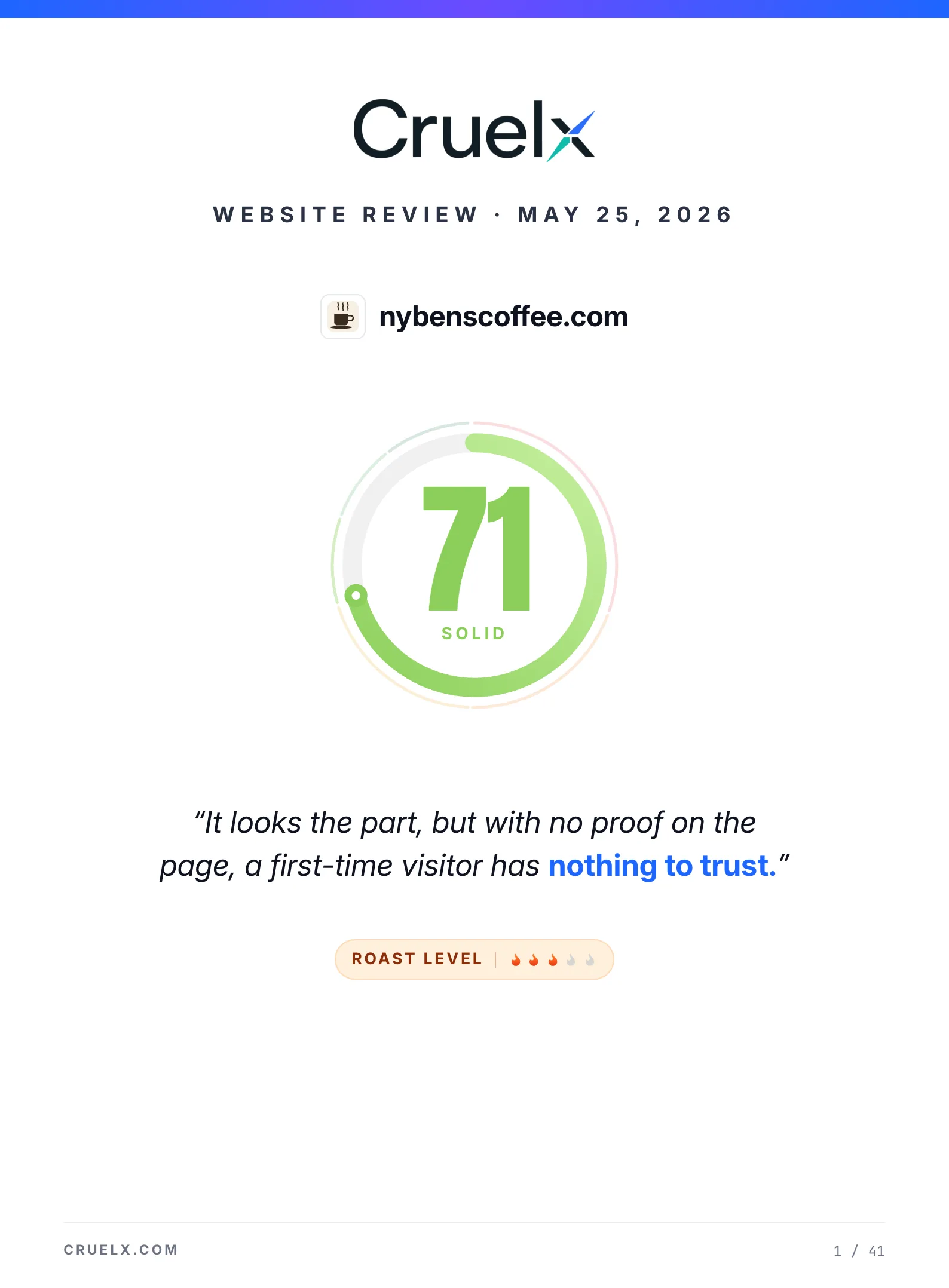
It looks the part, but with no proof on the page, a first-time visitor has nothing to trust.
Roast Level
Sample report
A sample Cruelx review of a neighborhood coffee shop — the score, the issues hurting it most, and the exact fixes. See what your own site would get.
Top burns
Quick wins
Critical issues
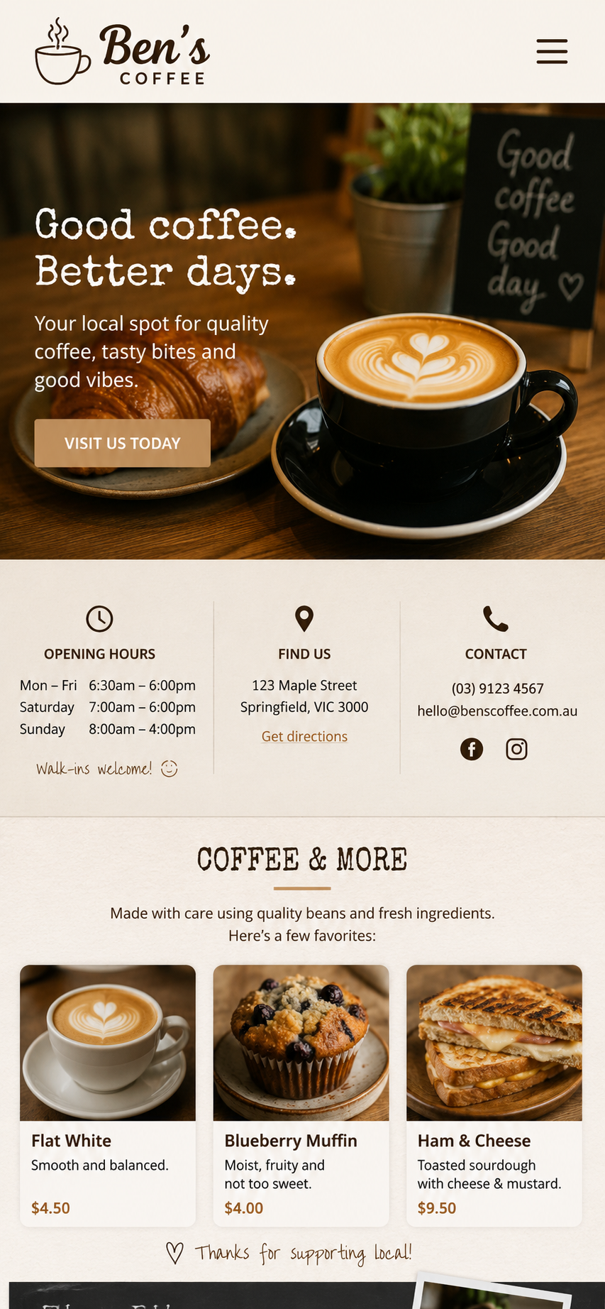
Three product cards sit under 'a few favorites' with no menu link. Phone-browsing locals can't tell what else exists.
Pair it next to 'Visit us today' as the new primary action. Captures the phone-browsing audience scanning menus.
5 pillars · weighted total
Ben's Coffee gets the basics right: warm photography, clear hours, a real address and phone number, and product cards that feel like a neighborhood cafe. The homepage reads as authentic and local.
The leak is one missing link. No menu page, no founder story, no reviews, and a single 'Visit us today' CTA that only converts the already-walking-in crowd. Add a menu link, a story, two reviews, and a 'See the menu' button.
What's hurting conversion
Three product cards sit under 'a few favorites' with no menu link. Phone-browsing locals can't tell what else exists.
Add a 'See the full menu' button next to the product row — even a one-page menu link beats the implicit guess.
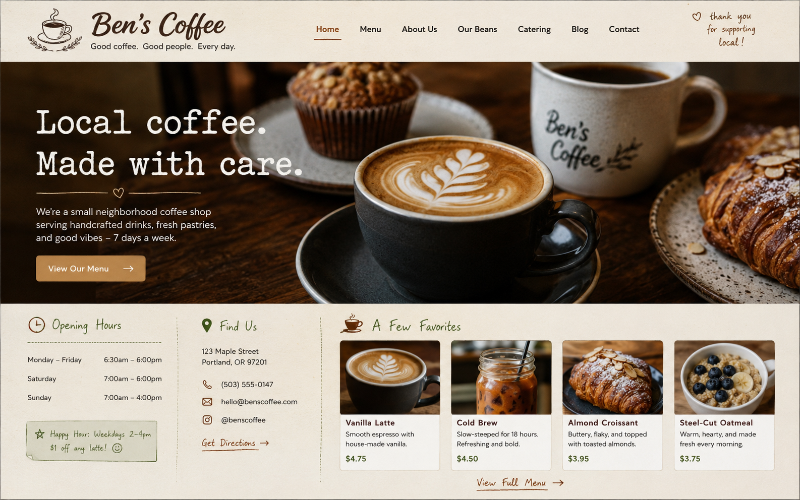
The hero CTA assumes the visitor is choosing where to walk in this morning. Most phone visitors are still comparing.
Add 'See the menu' as primary, demote 'Visit us today' to a secondary text link below it on mobile.
The only credibility cue is the photography itself. No stars, no Google review quotes, no neighborhood mention.
Pull two short Google reviews and pin them under the product row with star count and reviewer first name.
Move first
Pair it next to 'Visit us today' as the new primary action. Captures the phone-browsing audience scanning menus.
Pull two short five-star reviews under the product row with reviewer first name and star count. Trust scaffolding.
Rewrite the current generic line to name your neighborhood and one signature item. Specific wins in 'coffee near me'.
01—Pillar
SEO
Discoverability, metadata, semantic structure, indexability.
Basics are present but the local-business essentials that drive 'coffee near me' searches are missing. No LocalBusiness schema, generic meta, broken og:image.
Hygiene checklist
LocalBusiness schema
No JSON-LD on the page. Map Pack and rich results unreachable.
robots.txt
No robots.txt at site root. Crawlers default to permissive.
sitemap.xml
No sitemap. With a single-page site, low priority but worth a stub.
Open Graph tags
og:title and og:description present but og:image returns 404.
Image alt text density
Hero and product photos have empty alt attributes across the page.
Findings
Google can't read this as a cafe with hours and address, so the Map Pack stays out of reach.
Fix
Drop a LocalBusiness JSON-LD block listing address, geo, openingHours, telephone, and priceRange.
Reads like every other coffee shop on the street and won't differentiate in the search snippet.
Fix
Rewrite to 150 chars naming the neighborhood, a signature drink, and walk-ins welcome.
02—Pillar
Technical
Markup hygiene, accessibility, broken paths, performance hints.
HTTPS, semantic markup, and clean structure carry the score. Image weight and a few accessibility misses keep it from polished but nothing here is broken.
Findings
A 2.4MB hero PNG ships on every visit and pushes mobile Largest Contentful Paint past 3.5s.
Fix
Convert to AVIF at 180KB max and add a mobile-sized srcset crop for phones.
Keyboard and screen-reader users tab through the entire header before reaching the headline.
Fix
Add a visually-hidden 'Skip to content' link as the first focusable element, show on :focus.
03—Pillar
Marketing & brand
Audience fit, brand alignment, offer clarity, trust signals, copy punch.
Real photography, clear pricing, and an honest small-cafe voice carry the page. Conversion is the weak spot — one CTA, no menu link, no proof, generic tagline.
Sub-scores
Warm cream-and-brown palette plus honest photography reads correctly for locals 25-55 wanting a relaxed cafe vibe. The 'walk-ins welcome' tone reinforces it.
Voice is consistent across hero, contact card, and product copy — warm, plain-spoken, no marketing-speak. Cursive flourishes add personality without breaking type.
Weakest sub-score. One CTA, no menu link, products shown as 'a few favorites'. A first-time mobile visitor has to guess more food exists somewhere.
Real address, phone, email, hours, and social links all visible. The 'Thanks for supporting local!' feels authentic. Missing: reviews, founder photo.
Findings
'Good coffee. Better days.' is warm but generic — nothing tells a visitor what's different.
Fix
Rewrite as a postcard: name the neighborhood, a signature drink, or the regular you want.
No Ben photo, no story, no signature on the chalkboard — cafe feels like a brand, not a person.
Fix
Add a 'Hi, I'm Ben' card above the contact section with a candid photo and two short sentences.
04—Pillar
Design
Color system, typography, visual hierarchy, whitespace, consistency.
Cohesive cafe palette, warm photography, and intentional cursive flourishes give the site a consistent neighborhood feel. Mobile hierarchy is the weak spot.
Typography
Two display faces compete in the hero — a slab-serif headline and a cursive wordmark. Body type is a clean sans (Inter or DM Sans). Demote the wordmark and let the slab carry the display weight alone.
Hierarchy
Desktop hierarchy reads cleanly: photo, headline, subhead, CTA. Mobile is crowded. Product cards have flat internal hierarchy when the price should win. Hours card uses too many type sizes.
Color palette
#f5efe2
background
#2a1f12
text
#d4b896
accent
#ffffff
surface
#3a2c1e
secondary
#8b6b3d
primary
Findings
Hero photo, headline, subhead, and CTA all fight for the iPhone-class viewport and shrink to fit.
Fix
Drop the subhead on mobile or move it below the CTA so the photo and headline can anchor.
The serif headline and cursive wordmark both live at display weight in the hero stage.
Fix
Demote the wordmark to a small mono label in the header and let the slab carry the headline.
05—Pillar
Buyer psychology
How visitors hesitate, trust, and decide — clarity, value, differentiation, risk reduction, emotional pull.
Strong on emotional pull and trust — site feels honest and authentic. Weak on differentiation and specificity. A visitor reads 'cafe' but not 'why this one'.
Sub-scores
Visitors get 'this is a cafe' in two seconds. They don't get 'which cafe, for whom, and why this one' until they scroll past the hero.
'Quality coffee, tasty bites and good vibes' could describe any cafe in any town. No named bean, no signature drink, no pastry supplier.
Weakest sub-score. Nothing on the homepage answers why Ben's over the next cafe. Photography is warm but generic to the cafe category.
Honest pricing visible on every product. $4.50 flat white, $4.00 muffin, $9.50 sandwich read as fair. No upsells hiding anywhere.
Real hours, address, phone, email reduce basic 'is this real?' risk. Missing: reviews, guarantees, named team — the deeper-trust cues.
Strongest sub-score. Warm photography, handwritten flourishes, smiley after 'Walk-ins welcome' all do real work. Feels like a place.
Psychology levers
social proof
missingNo reviews, ratings, photos of regulars, or 'cups poured' counts. The cafe is invisible socially despite Instagram existing.
Do — Pin two short Google reviews under the products with star count and reviewer first name.
reciprocity
missingNothing gives the visitor something before asking them to visit — no free-first-coffee, no recipe, no guide.
Do — Add 'show this on your phone for $1 off your first flat white' and watch walk-ins climb.
authority
missingNo roaster partner named, no press mention, no barista qualifications shown anywhere on the homepage today.
Do — Add one authority line — roaster partner, barista cert, or a 'featured in local press' badge.
Findings
Nothing on the homepage answers 'what makes Ben's different from the cafe next door'.
Fix
Add a 'Why Ben's' line below the hero with a signature item, sourcing detail, or founder story.
Most phone visitors are checking the menu, not committing to walk in this morning yet.
Fix
Match the visitor's stage — 'See the menu' on mobile, 'Visit us today' as secondary.
What to ship
Next 48 hours
Add 'See the menu' button to hero
Pair next to 'Visit us today'. Highest-leverage homepage change today.
Marketing & brandPin two Google review quotes
Drop under product row with stars and first names. Trust scaffolding the homepage misses.
Buyer psychologyFix the broken og:image tag
Set to a 1200×630 latte hero shot. Stops shared links from looking like broken tags.
SEOBuyer psychology · our edge
Strong on emotional pull and trust — site feels honest and authentic. Weak on differentiation and specificity. A visitor reads 'cafe' but not 'why this one'.
Buyer-psychology sub-scores · nybenscoffee.com
Why this visitor leaves
No reviews, ratings, photos of regulars, or 'cups poured' counts. The cafe is invisible socially despite Instagram existing.
The homepage shows three products but no menu link. A visitor can't tell whether the menu is three items or thirty items.
Nothing gives the visitor something before asking them to visit — no free-first-coffee, no recipe, no guide.
No roaster partner named, no press mention, no barista qualifications shown anywhere on the homepage today.
No limited-batch drinks, no rotating specials, no seasonal item is called out anywhere on the homepage today.
Nothing prompts a small first commitment — no newsletter signup, no Instagram follow ask, no loyalty card.
What you get
The free report is a real audit: score, top issues, and quick wins. The full report adds every pillar, the priority roadmap, copy rewrites, and a polished PDF.
Inside the full report
Free Report. No credit card. A couple of minutes.